Blocacid entered a crowded therapeutic space but with a clear and relatable USP — its tablet was significantly smaller, making it far easier to swallow than traditional options. With this as the hero benefit, we crafted a campaign that would immediately connect with the real-life struggle of pill intake.
Creative Concept & Design
Concept & Thought Process
We built the campaign around a striking visual metaphor:
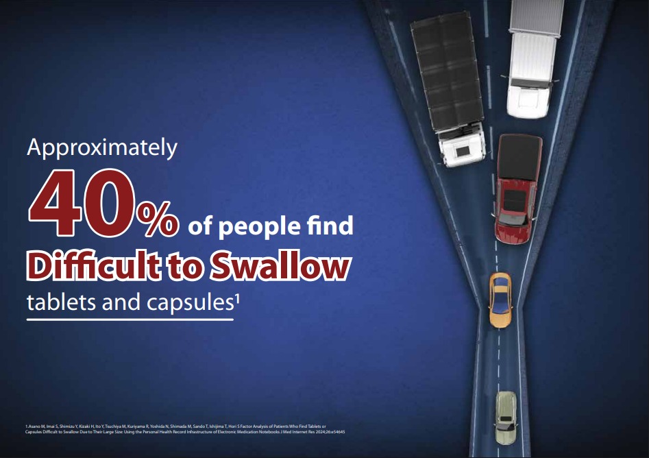
Swallowing isn’t always easy — especially when the pill feels like a roadblock.
The creative shows larger vehicles clogging a narrow road, representing bulky tablets. In contrast, a smaller, sleeker car represents Blocacid — smoothly passing through, symbolizing its convenient swallowing experience.
Headline:
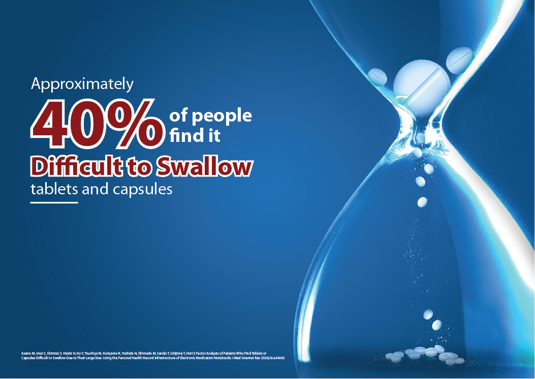
“Approximately 40% of people find it difficult to swallow tablets and capsules.” This stat built immediate relevance and urgency, drawing doctors’ and patients’ attention toward the problem.
Supporting Copy Focused On:
Ease of compliance
Patient comfort = better outcomes
Blocacid: Designed with empathy
Execution
Key Visual: The traffic jam analogy was used across digital banners, detailing aids, LBLs, and e-detailers.
Doctor Touchpoints: Clinic visuals and interactive charts showing patient feedback on tablet sizes.
Medical Rep Training Aids: Focus on positioning Blocacid as “The smarter tablet that doesn’t get stuck.”
Conclusion
This campaign helped Blocacid stand out not just for what it treats — but how it treats. By emphasizing form factor and comfort, we gave the brand a patient-first narrative that’s both empathetic and effective.